There are a multitude of technical systems and indicators available to investors today due to enhanced computerization, one of the most effective and basic tools of Technical Analysis is the Bar Chart.
As we wrote in our previous piece, Fundamental vs. Technical Analysis, Technical Analysis relies on the market to determine value. The technician accepts the price and volume of a security as the sum of all available fundamental information – company-specific and macro-economic – plus investors’ expectations.
It is this addition of the aggregate of investor expectations to the known fundamental data that makes Technical Analysis unique and valuable. Technical stock charts provide visual representations of the past price action of a security in order to predict its future direction.
When you learn how to invest, a stock bar chart analysis can enable you to discern trading patterns and trends not readily apparent only in financial statements or news releases. The patterns and trends discovered are important as they constantly confirm or challenge an investor’s assumptions and decisions.
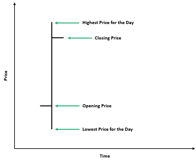
Bar charts display the price range of a security over a period of time. A daily bar chart for example will show the high price and low price for that day, which makes up the length of the bar.
The opening and closing prices are also usually indicated by dashes on the bar – the open on the left side and the close on the right.
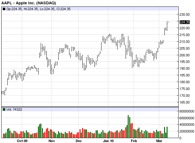
These bars are plotted on a graph where the vertical axis is price and the horizontal axis is time. The time period can vary by minute, hour, daily, weekly, monthly, yearly, etc. Basically, longer views guide investment decisions (buy, sell, or hold) and shorter views aid trading decisions (at what price and when).
Usually, an additional graph shows the volume of shares traded for the corresponding time increment. This volume is an important confirmation tool to the price chart.
Over a short period, bar charts may not tell the investor much; however, over longer time horizons the investor will see more bars – more information – where predictive patterns and trendlines emerge.
Each bar length represents volatility, with longer bars depicting greater intra-period moves. The bar length, especially when coupled with volume, also indicates supply and demand. The greater the demand, the longer the bar and the higher the closing price is from the previous close.
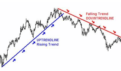
An increase in volume will confirm this increased demand. Thus, bar charts portray whether buyers or sellers (the demand or supply) are greater and how volatile the security tends to be over time. The addition of trendlines provides historical trends that aid the investor in predicting future prices.
Trendlines are made by drawing a line along a series of low points (uptrend support) or high points (downtrend resistance) in a bar chart. These lines provide a historical trend that may be carried beyond the current timeframe. If impactful new company or macro information is not released, these past trendlines act as guidelines of future price behavior.
Best practices when using trendlines to minimize this risk is:
These actions will lessen data misinterpretation and ill-timed investment decisions.
Besides uptrends and downtrends, there are several basic patterns that can be predictive. A few simple patterns to rely upon are pennants, flags and trading envelopes.
Pennants are consolidations of price action over time, basically higher lows and lower highs, in the shape of a triangle or those old sports team pennants found in your grandparent’s basement. As the stock price range narrows, the timing of the impending move accelerates.
The price action in flags is similar to pennants, except they do not narrow to a point. However, once the security breaks to the upside or downside from a pennant or flag, an extended move in that direction usually follows.
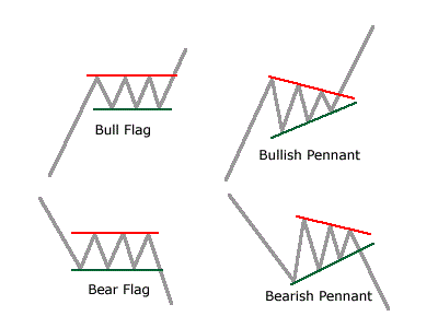
Trading envelopes are basically long-term flags that indicate stock price support and resistance trendlines. These envelopes, or bands, may have an upward, downward or sideways bias. These provide investors with a historical outlook to make buy and sell decisions.
Candlestick Charts are an ancient version of bar charts. In the mid-1700s, a Japanese merchant realized that psychological factors, such as fear and greed, moved the price of rice beyond the measurable laws of supply and demand.
He developed a visual system plotting these swings. He discovered consistent patterns which enabled him to greatly profit from the gyrations in the market. This system became known as Candlestick Charts, and these original bar charts are the first known Technical Analysis of price movement.
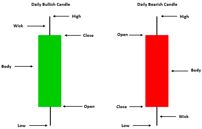
In Candlesticks, the bar has a body, or width, that represents the price range between the opening and closing prices of that day. If the close is higher than the open the body is in green. If lower, the body is in red. The other bar lengths, or wicks, represent the high and low prices of the day. T
The theory of Candlesticks is the same as Bar Charts: that all the known information, investor expectations and market psychology are embedded in the price of the security. The signals given are likewise similar.
However, while the added feature of the body provides more data, a greater chance for misinterpretation exists. This potential for information overload is a constant issue in the digital era. That is why investors, especially inexperienced ones, should focus upon basic and less complex methods of Technical Analysis.
In Summary
Bar Charts provide a meaningful visual representation of the price movement of a stock or index. These price portraits illuminate the potential buy and sell triggers or reaffirm previous investor decisions. Their simplistic view of the past, present and potential future direction of prices provide a manageable roadmap for the beginning or experienced investor. Bar Charts should be the first tool in an investor’s Technical Analysis toolbox.
Wealthplicity Recent Posts